#vue emit to parent component
Explore tagged Tumblr posts
Visit Tumblr Blog
Explore Tumblr blogs with no restrictions, modern design and the best experience.
Last Seen Tumblr Blogs


Fun Fact
The most popular pages on Tumblr are about Minecraft, GIFs, and David J. Peterson.
Text
How to pass value to child component in Vue.js
How to pass value to child component in Vue.js
Hello buddy, in this blog we will see how we can pass value to the child component in vue.js and we will also learn the use of props. Sharing data across components is one of the core functionalities of VueJS. It allows you to design a more modular project, control data scopes, and create a natural flow of data across your app. Think you are using the Vue tab component where you have put 5oo…

View On WordPress
#pass data to component vue#vue dynamic component#vue emit#vue get data from child component#vue pass data between sibling components#vue pass data from one component to another#vue pass data from parent to child#vue pass data to component onclick
0 notes
Text
Vue.js Tutorial From Scratch - e08 - Custom Events Passing Data from Child to Parent Component - VueJs
Vue.js Tutorial From Scratch – e08 – Custom Events Passing Data from Child to Parent Component – VueJs
Vue.js Tutorial From Scratch – e08 – Custom Events Passing Data from Child to Parent Component – VueJs
[ad_1]
Now that we have a nice modern npm and webpack build, let’s tackle getting our components to communicate. In Vue, this is done using custom events. We can emit an event on our child component and then listen for that event on our parent event. Follow along as we code a simple example from…
View On WordPress
#laravel computed property#laravel mix#laravel vue tutorial#Learn Vue#Learn Vuejs#passing data to parent component vue#vue#Vue 2019#vue course#vue emit to parent component#vue for beginners#vue framework#vue js frontend laravel backend#vue methods#vue npm#vue passing data between components#vue tutorial#vue webpack#Vue.js#vue.js tutorial 2019#Vuejs#vuejs course#vuejs tutorial#web development#web development framework#webpack crash course
0 notes
Text
vue 3.x components for bootstrap 5.x pagination and modals
The software ecosystem for vue 3.x is still evolving. I could not find any off-the-shelf components for pagination and modals, so I scratched up my own.
For the quick learners, you can visit the logic on github; code is distributed under the MIT license. In the coming days/weeks, I will try to set up parent views that exploit these components and illustrate their use, so please revisit the repo as needs be. For now, you're sledding downhill on your on.
Evan You from MIT is generally credited with authoring vueJS, a javascript framework for frontend development, while bootstrap -- a styling library -- grew out of efforts at Twitter, I believe. Both are fairly well-documented. Bootstrap probably enjoys wider adoption, but vueJS is holding its own in the modern frontend dev efforts.
Pagination
It's truly remarkable what vueJS in combination with bootstrap can accomplish on the web page. Here is what my component looks like for pagination:
<template>
<nav v-if="pagenav.numPages > 0" aria-label="Navigate through unvetted results">
<ul class="pagination justify-content-start">
<li class="page-item">
<a class="page-link" @click="previousPage" href="#">Previous</a>
</li>
<li v-for="pp in pagenav.numPages" :key="pp" class="page-item">
<a class="page-link" @click="navigateToPage(pp)" href="#"
:ref="setAnchor" v-bind:class="{ 'isSelected': isSelected(pp) }">{{ pp }}</a>
</li>
<li class="page-item">
<a class="page-link" @click="nextPage" href="#">Next</a>
</li>
</ul>
</nav>
</template>
<script>
import { computed, onBeforeUpdate, onUpdated } from 'vue';
export default {
name: "Pagination",
props: {
modelValue: {
type: Object,
default: () => {}
}
},
emits: ['update:modelValue'],
setup(props, { emit }) {
const pagenav = computed({
get: () => props.modelValue,
set: (value) => emit('update:modelValue', value),
});
let anchors = []
const setAnchor = el => {
if (el) {
anchors.push(el)
}
}
onBeforeUpdate(() => {
anchors = []
})
onUpdated(() => {
// Empty for now
})
const focusPageAnchor = () => {
anchors[pagenav.value.page].focus();
}
const isSelected = (pp) => {
return pagenav.value.page == (pp - 1);
};
return { pagenav, setAnchor, focusPageAnchor, isSelected };
},
methods: {
previousPage() {
this.pagenav.page = Math.max(0, this.pagenav.page - 1);
this.focusPageAnchor();
},
navigateToPage(pp) {
this.pagenav.page = pp - 1;
this.focusPageAnchor();
},
nextPage() {
this.pagenav.page = Math.min(this.pagenav.numPages - 1, this.pagenav.page + 1);
this.focusPageAnchor();
}
},
};
</script>
<style>
/* XXX color here is same as background color used by bootstrap for focused page-links */
a.isSelected {
background-color: rgb(234, 236, 239);
}
</style>
For 85 lines of markup and logic, this component does wonders. I will just highlight some of the hidden magic here:
* pagenav is a reactive variable injected into the Pagination component but declared, read, and written within the parent component. What that means is that the parent can function as a content manager, while the mechanics of pagination is deferred to the child component. The Pagination component can adjust the current page -- which in turn is picked up by the parent, which adjusts displayed content accordingly. In this light, pagination is a nice, compact example of modern, reactive programming.
* Use v-bind:class for conditional classes. The function isSelected highlights the currently selected page number, and it does so through selectively turning off/on the isSelected class. Got that? Conditional classes have been out there a long time, but here it's done in a fairly terse, reactive way.
PageModal
For purposes of rendering modal dialogs, I leverage bootstrap 5.x modals. My thinking was that I should not have to create new divs every time the UX/UI require a new popup dialog. So instead, I scratched up a component which abstracts away the mechanics of the modal, while leaving the parent view to dictate the profile of each modal. Some of the programming for PageModal is quite similar to the Pagination component.
Here's the logic:
<template>
<div>
<svg xmlns="http://www.w3.org/2000/svg" style="display: none;">
<symbol id="check-circle-fill" fill="currentColor" viewBox="0 0 16 16">
<path d="M16 8A8 8 0 1 1 0 8a8 8 0 0 1 16 0zm-3.97-3.03a.75.75 0 0 0-1.08.022L7.477 9.417 5.384 7.323a.75.75 0 0 0-1.06 1.06L6.97 11.03a.75.75 0 0 0 1.079-.02l3.992-4.99a.75.75 0 0 0-.01-1.05z"/>
</symbol>
<symbol id="info-fill" fill="currentColor" viewBox="0 0 16 16">
<path d="M8 16A8 8 0 1 0 8 0a8 8 0 0 0 0 16zm.93-9.412-1 4.705c-.07.34.029.533.304.533.194 0 .487-.07.686-.246l-.088.416c-.287.346-.92.598-1.465.598-.703 0-1.002-.422-.808-1.319l.738-3.468c.064-.293.006-.399-.287-.47l-.451-.081.082-.381 2.29-.287zM8 5.5a1 1 0 1 1 0-2 1 1 0 0 1 0 2z"/>
</symbol>
<symbol id="exclamation-triangle-fill" fill="currentColor" viewBox="0 0 16 16">
<path d="M8.982 1.566a1.13 1.13 0 0 0-1.96 0L.165 13.233c-.457.778.091 1.767.98 1.767h13.713c.889 0 1.438-.99.98-1.767L8.982 1.566zM8 5c.535 0 .954.462.9.995l-.35 3.507a.552.552 0 0 1-1.1 0L7.1 5.995A.905.905 0 0 1 8 5zm.002 6a1 1 0 1 1 0 2 1 1 0 0 1 0-2z"/>
</symbol>
</svg>
<div ref="activeModalRef" class="modal" tabindex="-1">
<div class="modal-dialog modal-dialog-centered">
<div class="modal-content">
<div class="modal-header alert d-flex align-items-center"
v-bind:class="{ 'alert-primary': isPrimary(), 'alert-warning': isWarning(), 'alert-info': isInfo() }" role="alert">
<svg v-if="activeModal.iconName == 'check-circle-fill'" class="bi flex-shrink-0 me-2" width="24" height="24" role="img" aria-label="Success:"><use xlink:href="#check-circle-fill"/></svg>
<svg v-if="activeModal.iconName == 'info-fill'" class="bi flex-shrink-0 me-2" width="24" height="24" role="img" aria-label="Information:"><use xlink:href="#info-fill"/></svg>
<svg v-if="activeModal.iconName == 'exclamation-triangle-fill'" class="bi flex-shrink-0 me-2" width="24" height="24" role="img" aria-label="Warning:"><use xlink:href="#exclamation-triangle-fill"/></svg>
<h5 class="modal-title">{{ activeModal.title }}</h5>
<button type="button" class="btn-close" data-bs-dismiss="modal" aria-label="Close"></button>
</div>
<div class="modal-body">
<p class="text-start">{{ activeModal.bodyMsg }}</p>
</div>
<div class="modal-footer">
<button v-if="activeModal.hasCancelBtn" type="button" class="btn btn-secondary" data-bs-dismiss="modal">Cancel</button>
<button @click="activeModal.okBtnCallback" type="button" class="btn btn-primary" data-bs-dismiss="modal">OK</button>
</div>
</div>
</div>
</div>
</div>
</template>
<script>
import { computed, onMounted, ref } from 'vue';
export default {
name: 'PageModal',
props: {
modelValue: {
type: Object,
default: () => {}
}
},
emits: ['update:modelValue'],
setup(props, { emit }) {
const activeModalRef = ref(null);
const activeModal = computed({
get: () => props.modelValue,
set: (value) => emit('update:modelValue', value)
});
onMounted(() => {
activeModal.value.ref = activeModalRef.value;
});
const isPrimary = () => {
return activeModal.value.iconName == 'check-circle-fill';
};
const isWarning = () => {
return activeModal.value.iconName == 'exclamation-triangle-fill';
};
const isInfo = () => {
return activeModal.value.iconName == 'info-fill';
};
return { activeModal, activeModalRef, isPrimary, isWarning, isInfo };
},
};
</script>
There likely are better approaches to this logic than what you see here. Here are some highlights:
* activeModal is a reactive variable similar to pagenav in the Pagination component. You can think of activeModal as determining the profile of some modal dialog -- the wording, any header icons, etc. The parent view sets activeModal, and when it raises the modal dialog, the latter is configured properly.
* activeModalRef is a reference to the HTML element -- a div here -- that encompasses the modal dialog. We need to convey that reference to the parent view so it can raise the modal as needs be.
* The svg element is an image sprite that, along with much of the vanilla modal mark-up, I simply copied from bootstrap's online documentation. By setting up an inline sprite, we can then specify self-referential icons in the modal headers.
Summary
That's all for now! When I have the time, I will scratch up examples of how parent views use these components.
Novemeber 17, 2021
0 notes
Link
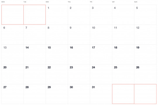
Have you ever seen a calendar on a webpage and thought, how the heck did they did that? For something like that, it might be natural to reach for a plugin, or even an embedded Google Calendar, but it’s actually a lot more straightforward to make one than you might think. Especially when we use the component-driven power of Vue.
I’ve set up a demo over at CodeSandbox so you can see what we’re aiming for, but it’s always a good idea to spell out what we’re trying to do:
Create a month view grid that displays the days of the current month
Display dates from the previous and next months to so the grid is always full
Indicate the current date
Show the name of the currently selected month
Navigate to the previous and next month
Allow the user to navigate back to the current month with a single click
Oh, and we’ll build this as a single page application that fetches calendar dates from Day.js, a super light utility library.
Step 1: Start with the basic markup
We’re going to jump straight into templates. If you’re new to Vue, Sarah’s introduction series is a nice place to start. It’s also worth noting that I’ll be linking to the Vue 2 docs throughout this post. Vue 3 is currently in beta and the docs for it are subject to change.
Let’s start with creating a basic template for our calendar. We can outline our markup as three layers where we have:
A section for the calendar header. This will show components with the currently selected month and the elements responsible for paginating between months.
A section for the calendar grid header. A table header that holds a list containing the days of the week, starting with Monday.
The calendar grid. You know, each day in the current month, represented as a square in the grid.
Let’s write this up in a file called CalendarMonth.vue. This will be our main component.
<!-- CalendarMonth.vue --> <template> <!-- Parent container for the calendar month --> <div class="calendar-month"> <!-- The calendar header --> <div class="calendar-month-header" <!-- Month name --> <CalendarDateIndicator /> <!-- Pagination --> <CalendarDateSelector /> </div> <!-- Calendar grid header --> <CalendarWeekdays /> <!-- Calendar grid --> <ol class="days-grid"> <CalendarMonthDayItem /> </ol> </div> </template>
Now that we have some markup to work with, let’s go one step further and create required components.
Step 2: Header components
In our header we have two components:
CalendarDateIndicator shows the currently selected month.
CalendarDateSelector is responsible for paginating between months.
Let’s start with CalendarDateIndicator. This component will accept a selectedDate property which is a Day.js object that will format the current date properly and show it to the user.
<!-- CalendarDateIndicator.vue --> <template> <div class="calendar-date-indicator"></div> </template> <script> export default { props: { selectedDate: { type: Object, required: true } }, computed: { selectedMonth() { return this.selectedDate.format("MMMM YYYY"); } } }; </script>
That was easy. Let’s go and create the pagination component that lets us navigate between months. It will contain three elements responsible for selecting the previous, current and next month. We’ll add an event listener on those that fires the appropriate method when the element is clicked.
<!-- CalendarDateSelector.vue --> <template> <div class="calendar-date-selector"> <span @click="selectPrevious">﹤</span> <span @click="selectCurrent">Today</span> <span @click="selectNext">﹥</span> </div> </template>
Then, in the script section, we will set up two props that the component will accept:
currentDate allows us to come back to current month when the “Today” button is clicked.
selectedDate tells us what month is currently selected.
We will also define methods responsible for calculating the new selected date based on the currently selected date using the subtract and add methods from Day.js. Each method will also $emit an event to the parent component with the newly selected month. This allows us to keep the value of selected date in one place — which will be our CalendarMonth.vue component — and pass it down to all child components (i.e. header, calendar grid).
// CalendarDateSelector.vue <script> import dayjs from "dayjs"; export default { name: "CalendarDateSelector", props: { currentDate: { type: String, required: true }, selectedDate: { type: Object, required: true } }, methods: { selectPrevious() { let newSelectedDate = dayjs(this.selectedDate).subtract(1, "month"); this.$emit("dateSelected", newSelectedDate); }, selectCurrent() { let newSelectedDate = dayjs(this.currentDate); this.$emit("dateSelected", newSelectedDate); }, selectNext() { let newSelectedDate = dayjs(this.selectedDate).add(1, "month"); this.$emit("dateSelected", newSelectedDate); } } }; </script>
Now, let’s go back to the CalendarMonth.vue component and use our newly created components.
To use them we first need to import and register the components, also we need to create the values that will be passed as props to those components:
today properly formats today’s date and is used as a value for the “Today” pagination button.
selectedDate is the currently selected date (set to today’s date by default).
The last thing we need to do before we can render the components is create a method that’s responsible for changing the value of selectedDate. This method will be fired when the event from the pagination component is received.
// CalendarMonth.vue <script> import dayjs from "dayjs"; import CalendarDateIndicator from "./CalendarDateIndicator"; import CalendarDateSelector from "./CalendarDateSelector"; export default { components: { CalendarDateIndicator, CalendarDateSelector }, data() { return { selectedDate: dayjs(), today: dayjs().format("YYYY-MM-DD") }; }, methods: { selectDate(newSelectedDate) { this.selectedDate = newSelectedDate; } } }; </script>
Now we have everything we need to render our calendar header:
<!-- CalendarMonth.vue --> <template> <div class="calendar-month"> <div class="calendar-month-header"> <CalendarDateIndicator :selected-date="selectedDate" class="calendar-month-header-selected-month" /> <CalendarDateSelector :current-date="today" :selected-date="selectedDate" @dateSelected="selectDate" /> </div> </div> </template>
This is a good spot to stop and see what we have so far. Our calendar header is doing everything we want, so let’s move forward and create components for our calendar grid.
Step 3: Calendar grid components
Here, again, we have two components:
CalendarWeekdays shows the names of the weekdays.
CalendarMonthDayItem represents a single day in the calendar.
The CalendarWeekdays component contains a list that iterates through the weekday labels (using the v-for directive) and renders that label for each weekday. In the script section, we need to define our weekdays and create a computed property to make it available in the template and cache the result to prevent us from having to re-calculate it in the future.
// CalendarWeekdays.vue <template> <ol class="day-of-week"> <li v-for="weekday in weekdays" :key="weekday" > </li> </ol> </template>
<script> const WEEKDAYS = ["Mon", "Tue", "Wed", "Thu", "Fri", "Sat", "Sun"]; export default { name: 'CalendarWeekdays', computed: { weekdays() { return WEEKDAYS } } } </script>
Next is CalendarMonthDayItem. It’s a list item that receives a day property that is an object, and a boolean prop, isToday, that allows us to style the list item to indicate that it’s the current date. We also have one computed property that formats the received day object to our desired date format (D, or the numeric day of the month).
// CalendarMonthDayItem.vue <template> <li class="calendar-day" :class="{ 'calendar-day--not-current': !isCurrentMonth, 'calendar-day--today': isToday }" > <span></span> </li> </template>
<script> import dayjs from "dayjs"; export default { name: "CalendarMonthDayItem", props: { day: { type: Object, required: true }, isCurrentMonth: { type: Boolean, default: false }, isToday: { type: Boolean, default: false } }, computed: { label() { return dayjs(this.day.date).format("D"); } } }; </script>
OK, now that we have these two components, let’s see how we can add them to our CalendarMonth component.
We first need to import and register them. We also need to create a computedproperty that will return an array of objects representing our days. Each day contains a date property and isCurrentMonth property.
// CalendarMonth.vue <script> import dayjs from "dayjs"; import CalendarMonthDayItem from "./CalendarMonthDayItem"; import CalendarWeekdays from "./CalendarWeekdays";
export default { name: "CalendarMonth", components: { // ... CalendarMonthDayItem, CalendarWeekdays }, computed: { days() { return [ { date: "2020-06-29", isCurrentMonth: false }, { date: "2020-06-30", isCurrentMonth: false }, { date: "2020-07-01", isCurrentMonth: true }, { date: "2020-07-02", isCurrentMonth: true }, // ... { date: "2020-07-31", isCurrentMonth: true }, { date: "2020-08-01", isCurrentMonth: false }, { date: "2020-08-02", isCurrentMonth: false } ]; } } }; </script>
Then, in the template, we can render our components. Again, we use the v-fordirective to render the required number of day elements.
<!-- CalendarMonth.vue --> <template> <div class="calendar-month"> <div class="calendar-month-header"> // ... </div> <CalendarWeekdays/> <ol class="days-grid"> <CalendarMonthDayItem v-for="day in days" :key="day.date" :day="day" :is-today="day.date === today" /> </ol> </div> </template>
OK, things are starting to look good now. Have a look at where we are. It looks nice but, as you probably noticed, the template only contains static data at the moment. The month is hardcoded as July and the day numbers are hardcoded as well. We will change that by calculating what date should be shown on a specific month. Let’s dive into the code!
Step 4: Setting up current month calendar
Let’s think how we can calculate the date that should be shown on a specific month. That’s where Day.js really comes into play. It provides all the data we need to properly place dates on the correct days of the week for a given month using real calendar data. It allows us to get and set anything from the start date of a month to all the date formatting options we need to display the data.
We will:
Get the current month
Calculate where the days should be placed (weekdays)
Calculate the days for displaying dates from the previous and next months
Put all of the days together in a single array
We already have Day.js imported in our CalendarMonth component. We’re also going to lean on a couple of Day.js plugins for help. WeekDay helps us set the first day of the week. Some prefer Sunday as the first day of the week. Other prefer Monday. Heck, in some cases, it makes sense to start with Friday. We’re going to start with Monday.
The WeekOfYear plugin returns the numeric value for the current week out of all weeks in the year. There are 52 weeks in a year, so we’d say that the week starting January 1 is the the first week of the year, and so on.
Here’s what we put into CalendarMonth.vue to put all of that to use:
// CalendarMonth.vue <script> import dayjs from "dayjs"; import weekday from "dayjs/plugin/weekday"; import weekOfYear from "dayjs/plugin/weekOfYear"; // ...
dayjs.extend(weekday); dayjs.extend(weekOfYear); // ...
That was pretty straightforward but now the real fun starts as we will now play with the calendar grid. Let’s stop for a second a think what we really need to do to get that right.
First, we want the date numbers to fall in the correct weekday columns. For example, July 1, 2020, is on a Wednesday. That’s where the date numbering should start.
If the first of the month falls on Wednesday, then that means we’ll have empty grid items for Monday and Tuesday in the first week. The last day of the month is July 31, which falls on a Friday. That means Saturday and Sunday will be empty in the last week of the grid. We want to fill those with the trailing and leading dates of the previous and next months, respectively, so that the calendar grid is always full.
Adding dates for the current month
To add the days of the current month to the grid, we need to know how many days exist in the current month. We can get that using the daysInMonth method provided by Day.js. Let’s create a computed property for that.
// CalendarMonth.vue computed: { // ... numberOfDaysInMonth() { return dayjs(this.selectedDate).daysInMonth(); } }
When we know that, we create an empty array with a length that’s equal to number of days in the current month. Then we map() that array and create a day object for each one. The object we create has an arbitrary structure, so you can add other properties if you need them.
In this example, though, we need a date property that will be used to check if a particular date is the current day. We’ll also return a isCurrentMonth value that checks whether the date is in the current month or outside of it. If it is outside the current month, we will style those so folks know they are outside the range of the current month.
// CalendarMonth.vue computed: { // ... currentMonthDays() { return [...Array(this.numberOfDaysInMonth)].map((day, index) => { return { date: dayjs(`${this.year}-${this.month}-${index + 1}`).format("YYYY-MM-DD") isCurrentMonth: true }; }); }, }
Adding dates from the previous month
To get dates from the previous month to display in the current month, we need to check what the weekday of the first day is in selected month. That’s where we can use the WeekDay plugin for Day.js. Let’s create a helper method for that.
// CalendarMonth.vue methods: { // ... getWeekday(date) { return dayjs(date).weekday(); }, }
Then, based on that, we need to check which day was the last Monday in the previous month. We need that value to know how many days from the previous month should be visible in the current month view. We can get that by subtracting the weekday value from the first day of the current month. For example, if first day of the month is Wednesday, we need to subtract three days to get last Monday of the previous month. Having that value allows us to create an array of day objects starting from the last Monday of the previous month through the end of that month.
// CalendarMonth.vue computed: { // ... previousMonthDays() { const firstDayOfTheMonthWeekday = this.getWeekday(this.currentMonthDays[0].date); const previousMonth = dayjs(`${this.year}-${this.month}-01`).subtract(1, "month"); const previousMonthLastMondayDayOfMonth = dayjs(this.currentMonthDays[0].date).subtract(firstDayOfTheMonthWeekday - 1, "day").date(); // Cover first day of the month being sunday (firstDayOfTheMonthWeekday === 0) const visibleNumberOfDaysFromPreviousMonth = firstDayOfTheMonthWeekday ? firstDayOfTheMonthWeekday - 1 : 6; return [...Array(visibleNumberOfDaysFromPreviousMonth)].map((day, index) = { return { date: dayjs(`${previousMonth.year()}-${previousMonth.month() + 1}-${previousMonthLastMondayDayOfMonth + index}`).format("YYYY-MM-DD"), isCurrentMonth: false }; }); } }
Adding dates from the next month
Now, let’s do the reverse and calculate which days we need from the next month to fill in the grid for the current month. Fortunately, we can use the same helper we just created for the previous month calculation. The difference is that we will calculate how many days from the next month should be visible by subtracting that weekday numeric value from seven.
So, for example, if the last day of the month is Saturday, we need to subtract one day from seven to construct an array of dates needed from next month (Sunday).
// CalendarMonth.vue computed: { // ... nextMonthDays() { const lastDayOfTheMonthWeekday = this.getWeekday(`${this.year}-${this.month}-${this.currentMonthDays.length}`); const nextMonth = dayjs(`${this.year}-${this.month}-01`).add(1, "month"); const visibleNumberOfDaysFromNextMonth = lastDayOfTheMonthWeekday ? 7 - lastDayOfTheMonthWeekday : lastDayOfTheMonthWeekday; return [...Array(visibleNumberOfDaysFromNextMonth)].map((day, index) => { return { date: dayjs(`${nextMonth.year()}-${nextMonth.month() + 1}-${index + 1}`).format("YYYY-MM-DD"), isCurrentMonth: false }; }); } }
OK, we know how to create all days we need, so let’s use them and merge all days into a single array of all the days we want to show in the current month, including filler dates from the previous and next months.
// CalendarMonth.vue computed: { // ... days() { return [ ...this.previousMonthDays, ...this.currentMonthDays, ...this.nextMonthDays ]; }, }
0 notes
Link
vue pass data between components,vue emit,vue emit example,custom events in vuejs,vue emit multiple parameters,vue event bus,vue emit event to parent,vue event bus vs vuex,vue pass data between sibling components,vue event bus in component,vue pass data to component,
0 notes
Text
Laravel + Vue.js AdminPanel Generator
News / May 11, 2018
Laravel + Vue.js AdminPanel Generator
Laravel and Vue.js are often used together. With more tools on these technologies are released, here’s one of them – presenting to you Vue+Laravel Admin Panel Generator.
Disclaimer: I’m the founder and one of the developers of this tool, and also Laravel-only generator QuickAdminPanel, but the goal in this article is not only to present you the product, but explain what it generates, and how Vue + Laravel work together. Also, you will find an example project with source available on Github.
How does the generator work?
For those who prefer video, here’s a quick demo:
youtube
Now, let’s look at it with more details.
Step 1. You create your panel without coding, just adding menu items and fields.
Step 2. At any point, you can view the generated code, file by file.
Step 3. Then you download the code and install it – locally or on your remote server, with these commands:
composer install php artisan key:generate php artisan migrate --seed php artisan passport:install
Of course, your .env file should be configured at that point.
And then, on the front-end:
npm install npm run dev
Step 4. That’s it; you have your panel.
Step 5. The most important thing: you can change the code however you want, it’s pure Laravel+Vue, without our generator’s package as a dependency. That’s the main difference from packages like Voyager or Laravel Backpack (which are both excellent, by the way!).
What are we generating – structure of the project
After you download the project, you see something like this:
Generated Code: Back-end Laravel
Let’s first analyze the back-end Laravel part, which serves as API:
Here’s routes/api.php file:
Route::group(['prefix' => '/v1', 'middleware' => ['auth:api'], 'namespace' => 'Api\V1', 'as' => 'api.'], function () { Route::post('change-password', 'ChangePasswordController@changePassword')->name('auth.change_password'); Route::apiResource('roles', 'RolesController'); Route::apiResource('users', 'UsersController'); Route::apiResource('companies', 'CompaniesController'); Route::apiResource('employees', 'EmployeesController'); });
You can see apiResource for every CRUD, and also one separate POST for changing the password.
Controllers are namespaces under Api/V1, so here’s our app/Http/Controllers/Api/V1/CompaniesController.php:
namespace App\Http\Controllers\Api\V1; use App\Company; use App\Http\Controllers\Controller; use App\Http\Resources\Company as CompanyResource; use App\Http\Requests\Admin\StoreCompaniesRequest; use App\Http\Requests\Admin\UpdateCompaniesRequest; use Illuminate\Http\Request; class CompaniesController extends Controller { public function index() { return new CompanyResource(Company::with([])->get()); } public function show($id) { $company = Company::with([])->findOrFail($id); return new CompanyResource($company); } public function store(StoreCompaniesRequest $request) { $company = Company::create($request->all()); return (new CompanyResource($company)) ->response() ->setStatusCode(201); } public function update(UpdateCompaniesRequest $request, $id) { $company = Company::findOrFail($id); $company->update($request->all()); return (new CompanyResource($company)) ->response() ->setStatusCode(202); } public function destroy($id) { $company = Company::findOrFail($id); $company->delete(); return response(null, 204); } }
We have a typical resourceful Controller, with one exception – Resources classes, which have been available since Laravel 5.5.
In our case, every resource is a simple conversion to an array, here’s a file app/Http/Resources/Company.php
namespace App\Http\Resources; use Illuminate\Http\Resources\Json\JsonResource; class Company extends JsonResource { /** * Transform the resource into an array. * * @param \Illuminate\Http\Request $request * @return array */ public function toArray($request) { return parent::toArray($request); } }
But you can extend it, adding your logic on top – see more examples here and here.
Finally, Laravel Passport protects all the routes – when installing the project, you need to run this:
php artisan passport:install
As an overall back-end result, every Controller is responsible for that specific CRUD operations called to the API, from Vue.js front-end.
Generated Code: Front-end Vue.js
Now, let’s take a look at front-end part. The main file for this is resources/client/assets/js/app.js, where we initiate the Vue and some libraries:
// ... window.Vue = require('vue') Vue.prototype.$eventHub = new Vue() import router from './routes' import store from './store' import Datatable from 'vue2-datatable-component' import VueAWN from 'vue-awesome-notifications' import vSelect from 'vue-select' import datePicker from 'vue-bootstrap-datetimepicker' import VueSweetalert2 from 'vue-sweetalert2' import 'eonasdan-bootstrap-datetimepicker/build/css/bootstrap-datetimepicker.css' Vue.use(Datatable) Vue.use(VueAWN, { position: 'top-right' }) Vue.use(datePicker) Vue.use(VueSweetalert2) Vue.component('back-buttton', require('./components/BackButton.vue')) Vue.component('bootstrap-alert', require('./components/Alert.vue')) Vue.component('event-hub', require('./components/EventHub.vue')) Vue.component('vue-button-spinner', require('./components/VueButtonSpinner.vue')) Vue.component('v-select', vSelect) moment.updateLocale(window.app_locale, { week: { dow: 1 } }) const app = new Vue({ data: { relationships: {}, dpconfigDate: { format: window.date_format_moment }, dpconfigTime: { format: window.time_format_moment }, dpconfigDatetime: { format: window.datetime_format_moment, sideBySide: true } }, router, store }).$mount('#app')
Next, every CRUD has its own set of components:
For showing the data table, we’re using vue2-datatable-component – here’s full code of resources/clients/assets/components/cruds/Companies/Index.vue:
<template> <section class="content-wrapper" style="min-height: 960px;"> <section class="content-header"> <h1>Companies</h1> </section> <section class="content"> <div class="row"> <div class="col-xs-12"> <div class="box"> <div class="box-header with-border"> <h3 class="box-title">List</h3> </div> <div class="box-body"> <div class="btn-group"> <router-link :to="{ name: xprops.route + '.create' }" class="btn btn-success btn-sm"> <i class="fa fa-plus"></i> Add new </router-link> <button type="button" class="btn btn-default btn-sm" @click="fetchData"> <i class="fa fa-refresh" :class="{'fa-spin': loading}"></i> Refresh </button> </div> </div> <div class="box-body"> <div class="row" v-if="loading"> <div class="col-xs-4 col-xs-offset-4"> <div class="alert text-center"> <i class="fa fa-spin fa-refresh"></i> Loading </div> </div> </div> <datatable v-if="!loading" :columns="columns" :data="data" :total="total" :query="query" :xprops="xprops" /> </div> </div> </div> </div> </section> </section> </template> <script> import { mapGetters, mapActions } from 'vuex' import DatatableActions from '../../dtmodules/DatatableActions' import DatatableSingle from '../../dtmodules/DatatableSingle' import DatatableList from '../../dtmodules/DatatableList' import DatatableCheckbox from '../../dtmodules/DatatableCheckbox' export default { data() { return { columns: [ { title: '#', field: 'id', sortable: true, colStyle: 'width: 50px;' }, { title: 'Name', field: 'name', sortable: true }, { title: 'Description', field: 'description', sortable: true }, { title: 'Actions', tdComp: DatatableActions, visible: true, thClass: 'text-right', tdClass: 'text-right', colStyle: 'width: 130px;' } ], query: { sort: 'id', order: 'desc' }, xprops: { module: 'CompaniesIndex', route: 'companies' } } }, created() { this.$root.relationships = this.relationships this.fetchData() }, destroyed() { this.resetState() }, computed: { ...mapGetters('CompaniesIndex', ['data', 'total', 'loading', 'relationships']), }, watch: { query: { handler(query) { this.setQuery(query) }, deep: true } }, methods: { ...mapActions('CompaniesIndex', ['fetchData', 'setQuery', 'resetState']), } } </script> <style scoped> </style>
Quite a lot of code, isn’t it? Of course, it could be more straightforward, but we tried to follow the official documentation and best practices, generating code for the cases that could be extended for bigger projects.
Next, we can take a look at Create.vue:
<template> <section class="content-wrapper" style="min-height: 960px;"> <section class="content-header"> <h1>Companies</h1> </section> <section class="content"> <div class="row"> <div class="col-xs-12"> <form @submit.prevent="submitForm"> <div class="box"> <div class="box-header with-border"> <h3 class="box-title">Create</h3> </div> <div class="box-body"> <back-buttton></back-buttton> </div> <bootstrap-alert /> <div class="box-body"> <div class="form-group"> <label for="name">Name</label> <input type="text" class="form-control" name="name" placeholder="Enter Name" :value="item.name" @input="updateName" > </div> <div class="form-group"> <label for="description">Description</label> <textarea rows="3" class="form-control" name="description" placeholder="Enter Description" :value="item.description" @input="updateDescription" > </textarea> </div> </div> <div class="box-footer"> <vue-button-spinner class="btn btn-primary btn-sm" :isLoading="loading" :disabled="loading" > Save </vue-button-spinner> </div> </div> </form> </div> </div> </section> </section> </template> <script> import { mapGetters, mapActions } from 'vuex' export default { data() { return { // Code... } }, computed: { ...mapGetters('CompaniesSingle', ['item', 'loading']) }, created() { // Code ... }, destroyed() { this.resetState() }, methods: { ...mapActions('CompaniesSingle', ['storeData', 'resetState', 'setName', 'setDescription']), updateName(e) { this.setName(e.target.value) }, updateDescription(e) { this.setDescription(e.target.value) }, submitForm() { this.storeData() .then(() => { this.$router.push({ name: 'companies.index' }) this.$eventHub.$emit('create-success') }) .catch((error) => { console.error(error) }) } } } </script> <style scoped> </style>
Edit and Show components for the CRUD are pretty similar, so won’t discuss them here.
In addition to that Vue code, there are many small details and helpers like Sweet Alert, Notifications, Datepickers, and setting/getting relationships data for the forms. I guess I will leave it for you to analyze.
Notice: The choice of Vue.js libraries is pretty subjective, and it was the most challenging part of the project – to choose the Vue libraries to trust. Ecosystem still lacks standards, or 100% trusted open-source – a lot of movement in the market, some libraries are better supported than others. So it’s always hard to guess, and the best libraries will probably change with time, or new ones will appear.
That’s the end of a quick overview of Vue+Laravel QuickAdminPanel, try it out here: https://vue.quickadminpanel.com
Finally, here’s the source of a demo-project with two CRUDs: Companies and Customers.
I hope our generator will not only save you time on writing code but also show you how Vue can work with Laravel. Our way of structuring this code is not the only way, and you can structure your code differently, but we tried our best to stick to standards.
via Laravel News https://ift.tt/2wzPFV6
0 notes
Link
In this article, we'll take a look at the biggest and best JavaScript frameworks around, and explore how to get the best out of them for your next projects. We'll look at Vue.js, React, AngularJS, Polymer and Aurelia – you can use the drop-down menu above to jump to the framework you want to explore first.
Most of these frameworks are open source projects, too, so you can dig in and see how they work – or even contribute yourself.
Vue.js

Best for:
Beginners
Lightweight applications with a small footprint
Vue.js is a progressive JavaScript framework for building user interfaces. An open source project (see the GitHub repo here), its ideal for beginners. The main library is focused on the view layer and all templates are valid HTML, making it easy to pick up. In the following two mini-tutorials, we'll walk through how to use Vue to manage multiple data stores, and speed up the first load to improve your site's performance.
01. Manage state with Vue
As with any component-based library, managing state in Vue can be tricky. While the application is small, it’s possible to keep things in sync by emitting events when values change. However, this can become brittle and prone to errors as the application grows, so it may be better to start out with a more centralised solution.
If you’re familiar with Flux and Redux, Vuex works in much the same way. State is held in one centralised location and is linked to the main Vue application. Everything that happens within the application is reflected somewhere within that state. Components can select what information is relevant to them and be notified if it changes, much like if it was part of its internal state.
A Vuex store is made up of four things: the state, getters, mutations and actions. The state is a single object that holds all the necessary data for the entire application. The way this object gets structured depends on the project, but would typically hold at least one value for each view.
Getters work like computed properties do inside components. Their value is derived from the state and any parameters passed into it. They can be used to filter lists without having to duplicate that logic inside every component that uses that list.
The state cannot be edited directly. Any updates must be performed through mutation methods supplied inside the store. These are usually simple actions that perform one change at a time. Each mutation method receives the state as an argument, which is then updated with the values needed to change.
Mutations need to be synchronous in order for Vuex to understand what has changed. For asynchronous logic – like a server call – actions can be used instead. Actions can return Promises, which lets Vuex know that the result will change in the future as well as enabling developers to chain actions together.
To perform a mutation, they have to be committed to the store by calling commit()and passing the name of the mutation method required. Actions need to be dispatched in a similar way with dispatch().
It’s good practice to have actions commit mutations rather than commit them manually. That way, all updating logic is held together in the same place. Components can then dispatch the actions directly, so long as they are mapped using the mapActions() method supplied by Vuex.
To avoid overcomplicating things, the store can also be broken up into individual modules that look after their own slice of the state. Each module can register its own state, getters, mutations and actions. State is combined between each module and grouped by their module name, in much the same way as combineReducers() works within Redux.pport.
02. Explore lazy load routes
By default, the entire contents of the application end up inside one JavaScript file, which can result in a slow page load. A lot of that content is never used on the first screen the user visits. Instead it can be split off from the main bundle and loaded in as and when needed.
Vue makes this process incredibly simple to set up, as vue-router has built-in support for lazy loading.
Vue supports using dynamic imports to define components. These return Promises, which resolve to the component itself. The router can then use that component to render the page like normal. These work alongside code splitting built in to Webpack, which makes it possible to use features like magic comments to define how components should be split.
React

Best for:
Sites and applications with complex view logic
Quick prototypes with a low barrier to entry
Launched in 2013, React is maintained by Facebook and Instagram, alongside a community of developers. It's component-based and declarative, and you can also use it to power mobile apps via React Native.
Here, we'll explain how to keep your code clean by separating your concerns, move contents outside of the root component, and ensure errors don't destabilise your application.
Use container and presentational components
As with any project, it's important to keep a separation of concerns. All React applications start off simple. As they grow, it can be tempting to keep adding logic to the same few components. In theory, this simplifies things by reducing the number of moving parts. When problems arise, however, these large components become prone to errors that are difficult to debug.
React and JSX encourage the creation on multiple small components to keep things as simple as possible. While breaking the interface down into smaller chunks can help with organisation, having a further separation between how a component works and what it looks like provides greater flexibility.
Container and presentational components are special names given to this separation. The container's job is to manage state and deal with interfacing with other parts of the application such as Redux, while the presentational component deals solely with providing the interface.
A container component will often be in charge of a small section of the UI, like a tweet. It will hold all the workings of that component – from storing state, like the number of likes, to the methods required for interaction, such as a mechanism for liking that tweet.
If the application makes use of external libraries, include at this point. For example, Redux's connect method would provide the container with a way of dispatching actions to the store without worrying the presentational component.
Containers will never render their
own UI and will instead render
another component – the presentational component.
This component will be passed props that detail all the information needed to render the view. If it needs to provide interactivity, the container will then pass down methods for this as well, which can be called like any other method.
Having this separation encourages developers to keep things as simple
as possible. If a container is starting
to grow too large, it makes it easy
to break off into a smaller set
of components.
If the inner workings of a component, such as its state, needs to change, this technique allows the presentational component to remain unaffected. This also means this component can be used somewhere else in the application without needing to adjust how it functions. As long as it keeps getting served the same data it will continue to work.
Render with portals
React 16 introduced the ability to return lots of different types of data from a component. While previously it had to be either a single component or 'null', the latest version allows strings, numbers, arrays and a new concept called 'portals'.
The return value of a render() method decides what React displays, which is shown at that point in the component hierarchy. Portals allow React to render any of these return types outside of the component they were called from.
These can be other parts of the page completely separate from the main application. They still form part of React and work just the same as any component, but are able to reach outside of the normal confines of
the root container.
A typical use case of this technique would be to trigger modal windows. To get correct positioning, overlay
and accessibility requirements out
of a modal it ideally needs to sit as a direct descendant of the <body>. The problem is, the root of a single page application will likely take up that position. Components managing modals will either need to trigger something in the root component, or render it out of place.
Here the Modal component returns a portal. The create function for it takes two arguments – what needs to be rendered and where it should render it. The second parameter is a regular DOM node reference, rather than anything specific to React.
In this example, it references a <div> at the top of the DOM tree that is a sibling of the main app container. It is possible to target any node, visible or not, as with any JavaScript. To use it, another component can summon Modal just like any other component. It will
then display its contents in the targeted node.
Because React events are synthetic, they are capable of bubbling up from the portal contents to the containing component, rather than the DOM node they are rendered in. In the modal example, this means that
the summoning component can
also handle its state, such as its visibility or contents.
Establish error boundaries
Unhandled errors can cause havoc in a JavaScript application. Without catching them as they happen, methods can stop executing half way. This can cause unpredictable behaviour if the user continues and is a bad experience all around.
Previous versions of React did not cope with these situations well. If an error occurred in a nested component, it would leave its parents in limbo. The component state object would be stuck in the middle of performing an operation that could end up locking up the interface.
As of version 16, the way React handles errors has changed. Now an error inside any component would unmount the entire application. While that would stop issues arising with an unstable state, it doesn't lend itself well to a good user experience.
To avoid this, we can create a special component called an error boundary to ring-fence parts of the application from the rest. Any errors that happen inside children of the boundary will not cause issues to those outside of it.
Error boundaries work a lot like typical catch blocks in JavaScript. When an error occurs somewhere inside the component tree, it will be caught by the componentDidCatch() method, which receives the error thrown along with a stack trace. When that gets called it is an opportunity to replace the tree with a fresh interface – typically an error message.
Since it only renders its children, this component
can wrap others
to catch any errors that happen within it. The components chosen for this will vary by application, but error boundaries can be placed wherever they are needed, including inside other boundaries.
Error boundary components shouldn't be too complicated. If an error occurs inside of a boundary, it will bubble up to the next boundary up. Failing that, it will unmount the whole application as usual.
AngularJS

Best for:
Large projects in need of structure
Applications with lots of changing data
AngularJS is an open source frontend web application framework developed by Google. It offers declarative templates with data-binding, MVW, MVVM, MVC, and dependency injection, all implemented using pure client-side JavaScript.
Here, we'll show you how to use AngularJS to create reusable code blocks known as custom decorators, serve content to your users quicker, and create performant and easy to control animations with ease.
Create custom decorators
TypeScript is a superset that sits on top of JavaScript. It supplies features such as static typing, classes and interfaces that are lacking in the native language. This means that when creating large applications developers can get feedback on how best to work with external code and avoid unnecessary bugs.
Angular is built exclusively on top of TypeScript, so it is important to understand how to utilise it correctly. Combining the strengths of both provides a solid foundation for the application as it grows. There are not many better techniques to demonstrate this than with decorators.
Decorators are special functions designed to supply behaviour to whatever it is applied to. Angular makes extensive use of them to provide hints to the compiler, like with @Component on classes or @Input on properties.
The aim is to make these functions as reusable as possible and are often used to provide utility functions, such as logging. In the example above, @ClassLogger is supplied to a component to log to the console when certain lifecycle hooks are fired. This could be applied to any component to track its behaviour.
The ClassLogger example above returns a function, which enables us
to customise the behaviour of the decorator as it is created. This is known as the decorator factory pattern, which is used by Angular
to create its own decorators.
To apply a decorator, it needs to be positioned just before what it is decorating. Because of the way they are designed, decorators can be stacked on top of each other, including Angular's own. TypeScript will chain these decorators together and combine their behaviours.
Decorators are not just limited to classes. They can be applied to properties, methods and parameters inside of them as well. All of these follow similar patterns, but are slightly different in their implementations.
This is an example of a plain method decorator. These take three arguments – the object targeted, the name of the method, and the descriptor that provides details on its implementation. By hooking into the value of that descriptor we can replace the behaviour of the method based on
the needs of the decorator.
Build platform-level animations
Animations are a great way to introduce a friendly side to an interface. But trying to control animations in JavaScript can be problematic. Adjusting dimensions like height is bad for performance, while toggling classes
can quickly get confusing. The Web Animations API is a good approach, but working with it inside Angular can be tricky.
Angular provides a module that enables components to be animated by integrating with the properties already within the class. It uses a syntax similar to CSS-based animations, which gets passed in as component metadata.
Each animation is defined by a 'trigger' – a grouping of states and transition effects. Each state is a string value that, when matched, applies the associated styles to the element. The transition values define different ways the element should move between those states. In this example, once the value bound to hidden evaluates to true, the element will shrink out of view.
Two other special states are also defined: void and *. The void state relates to a component that was not in the view at the time and can be used to animate it in or out. The wildcard * will match with any state and could be used to provide a dimming effect while any transition occurs.
Inside the template, the trigger is bound to a value within the component that represents the state. As that value changes, as does the state of the animation.
That bound value can be supplied either as a plain property or as the output of a method, but the result needs to evaluate into a string that can be matched against an animation state.
These animations also provide callbacks such as when they start
or stop. This can be useful for removing components that are
no longer visible.
Serve content quicker with server rendering
HTML parsers struggle with JavaScript frameworks. Web crawlers are often not sophisticated enough to understand how Angular works, so they only see a single, blank element and not the whole application.
By rendering the application on the server, it sends down an initial view for the users to look at while Angular and the rest of the functionality downloads in the background. Once the application arrives, it silently picks up from where the server left off.
The tools needed to achieve this in Angular are now a native part of the platform as of version 4. With a bit of set up, any application can be server rendered with just a few tweaks.
Both server and browser builds need their own modules, but share a lot of common logic. Both need a special version of BrowserModule, which allows Angular to replace the contents on-screen when it loads in. The server also needs ServerModule to generate the appropriate HTML.
Servers also need their own entry points where they can bootstrap their unique behaviours as necessary. That behaviour depends on the app, but will also likely mirror much of the main browser entry point.
If using the CLI, that also needs to be aware of how to build the project for the server by pointing to the new entry point. This can be triggered by using the "--app" flag when building
for the server.
The application is now ready to be server rendered. Implementations will vary based on the server technology used, but the base principles remain the same. For example, Angular provide an Express engine for Node, which can be used to populate the index page based on the request sent. All the server needs to do is serve that file. Server rendering is a complex subject with many edge cases (look here for more information).
Polymer

Best for:
Combining with other platforms and frameworks
Working with JavaScript standards
Polymer is a lightweight library designed to help you take full advantage of Web Components. Read on to find out how to use it to create pain-free forms, bundle your components to keep requests low and sizes small, and finally how to upgrade to the latest Polymer release: 3.0.
Work with forms
Custom elements are part of the browser. Once they are set up they work like any native element would do on the page. Most of the time, Polymer is just bridging the gap between now and what custom elements will be capable of in the future, along with bringing features like data binding.
One place where custom elements shine is their use as form inputs. Native input types in browsers are limited at best, but provide a reliable way of sending data. In cases where a suitable input isn't available – such as in an autocomplete field, for example – then custom elements can provide a suitable drop-in solution.
As their work is performed within the shadow DOM, however, custom input values will not get submitted alongside regular form elements like usual. Browsers will just skip over them without looking at their contents.
One way around this is to use an <iron-form> component, which is provided by the Polymer team. This component wraps around an existing form and will find any values either as a native input or custom element. Provided a component exposes a form value somewhere within the element, it will be detected and sent like usual.
In cases where a custom element does not expose an input, it's still possible to use that element within a form, provided it exposes a property that can be bound to.
If <my-input> exposes a property like "value" to hook into we can pull that value out as part of a two-way binding. The value can then be read out into a separate hidden input as part of the main form. It can be transformed at this point into a string to make it suitable for form transmission. Forms not managed by Polymer that would need to make use of these bindings, the Polymer team also provide a <dom-bind>component to automatically bind these values.
Bundle components
One of Polymer's biggest advantages is that components can be imported and used without any need for a build process. As optimised as these imports may be, each component requires a fresh request, which slows things down. While HTTP/2 would speed things up in newer browsers, those who do not support it will have a severely degraded experience. For those users, files should be bundled together.
If a project is set up using the Polymer CLI, bundling is already built in to the project. By running polymer build, the tool will collect all components throughout the project and inline any subcomponents they use.
This cuts down on requests, removes unnecessary comments and minifies to reduce the file size. It also has the added benefit of creating separate bundles for both ES5 and ES2015 to support all browsers.
Outside of Polymer CLI, applications can still be bundled using the separate Polymer Bundler library. This works much like the CLI, but is more of a manual process. By supplying a component, it will sift through the imports of the file,
inline their contents, and output a bundled file.
Polymer Bundler has a few separate options to customise the output. For example, developers can choose to keep comments or only inline specific components.
Upgrade to Polymer 3.0
The philosophy behind Polymer is to 'use the platform': instead of fighting against browser features, work with them to make the experience better for everyone. HTML imports are a key part of Polymer 2, but are being removed from the web components specification moving forward.
Polymer 3.0 changes the way that components are written to work with more established standards. While no breaking changes are made with the framework itself, it's important
to know how the syntax changes
in this new version.
First thing to note is that Polymer is migrating away from Bower as a package manager. To keep up with the way developers work, npm will become the home of Polymer, as well as any related components in the future.
To avoid using HTML imports, components are imported as JavaScript modules using the existing standardised syntax.
The major difference inside a component is that the class is now exported directly. This enables the module import <script> tag to
work correctly. Any other components can be included by using ES2015 import statements within this file.
Finally, templates have been moved into the class and work
with template literals. A project by the Polymer team called lit-html is working to provide the same flexibility as <template> tags
along with the efficiency of
selective DOM manipulation.
Aurelia

Best for:
Simple applications with
little setup
Developing alongside
web standards
Aurelia is a JavaScript client framework for web, mobile and desktop. It's written with next-gen ECMAScript, integrates with Web Components and has no external dependencies.
Read on for two mini-tutorials, showing you how to change how properties display value and function, and how to use Aurelia to check values in forms.
01. Use value converters
Sometimes, when developing components, the values being stored do not lend themselves well to being displayed in a view. A Date object, for example, has an unhelpful value when converted to a string, which requires developers to make special conversion methods just to show values correctly.
To get around this problem, Aurelia provides a mechanism to use classes to change values, known as value converters. These can take any kind of value, apply some kind of processing to it, and output that changed value in place of the original.
They work similar to pipes in Angular or filters in template languages like Twig.
Most will be one way – from the model to the view. But they can also work the other way. The same logic applies, but by using fromView instead of toView, values can be adjusted before they are returned back to the model.
A good use-case for this would be to format user input directly from the bind on the element. In this example, it will capitalise every word that is entered, which may be useful for a naming field.
They can also be chained together, which encourages the creation of composable converters that can have different uses across the application. One converter could filter an array of values, which then passes to another that sorts them.
Converters can also be given simple arguments that can alter the way they behave. Instead of creating different converters to perform similar filtering, create one that takes the type of filter to be performed as an argument. While only one argument is allowed, they can be chained together to achieve the same effect.
02. Try framework-level form validation
Validation is an important part of any application. Users need to be putting the correct information into forms for everything to work correctly. If they do not, they should be warned of the fact as early as possible.
While validation can often be a tricky process, Aurelia has support for validating properties built right into the framework. As long as form values are bound to class properties, Aurelia can check that they are correct whenever it makes sense to the application.
Aurelia provides a ValidationController, which takes instructions from the class, looks over the associated properties and supplies the template with any checks that have failed.
Each controller requires a single ValidationRules class that defines what's to be checked. These are all chained together, which enables the controller to logically flow through the checks dependant on the options that are passed.
Each ruleset begins with a call to ensure(), which takes the name of
the property being checked. Any commands that follow will apply
to that property.
Next are the rules. There are plenty of built-in options like required() or email() that cover common scenarios. Anything else can use satisfies(), which takes a function that returns either a Boolean or a Promise that passes or fails the check.
After the rules come any customisations of that check, for example the error message to display. Rules provide default messages, but these can be overridden if necessary.
Finally, calling on() applies the ruleset to the class specified. If it is being defined from within the constructor of the class, it can be called with this instead.
By default, validation will be fired whenever a bound property's input element is blurred. This can be changed to happen either when the property changes, or it can be triggered manually.
0 notes
Text
Vue-Emit data from child to parent in vue js
Vue-Emit data from child to parent in vue js
In this article, we will learn about how to emit data from child to parent in VueJS with the example, I will show you an example that how we can pass child data to our parent component, We will use emit method to pass the data from the child component to the parent component in vuejs. Let’s suppose my child component name as Child.vue and have the below code into it. <template> <div> <b-tabs…

View On WordPress
1 note
·
View note
Photo

New Post has been published on http://programmingbiters.com/build-a-reusable-autocomplete-component-with-vue-2-1-part-2/
Build a Reusable Autocomplete Component with Vue 2.1 - part 2
In this second, and final, part, we’ll add the necessary keyboard and mouse interactions, implement selecting an option, and filter the displayed options depending on what’s typed in in the input.
Closing or opening the options dropdown
Right now, we can see that the options dropdown is always open. This, obviously, isn’t the way it should be. The dropdown should be shown only when the user types something in the input. And it should be closed when the user clears the input, presses escape key, or blurs the input.
The first step to accomplish this is to add isOpen in the component’s data list and set its default value to false.
data () return isOpen: false
With that being added, use that boolean on the dropdown container, ul.options-list, using v-show, like this:
<ul v-show="isOpen" class="options-list" >
Now we get to the events part. We need to register three events on the input element – @input, @keyup.esc, and @blur.
<input class="input is-large" placeholder="Search..." @input="onInput($event.target.value)" @keyup.esc="isOpen = false" @blur="isOpen = false" >
For @keyup and @blur, everything is ready. But for @input, we have to define a new method called onInput accepting the value of the input.
methods: onInput (value) this.isOpen = !!value
What that method does is check whether the entered text, after casting it to boolean, is empty or not. And using that value we close or open the dropdown.
Highlighting options with keyboard’s up/down arrow keys
Our next task is to let users select options using the keyboard’s arrow keys.
We first need to keep track of the position of the highlighted option. Thus, add highlightedPosition to component’s data list.
data () return isOpen: false, highlightedPosition: 0
We’re going to use a dynamic class, named .highlighted, to show the currently highlighted option. And we decide whether the class should be applied to the option by comparing the option’s index with highlightedPosition.
So, modify the option element in the component like this:
<li v-for="(option, index) in options" :class=" 'highlighted': index === highlightedPosition " >
Now we’ve dynamically styled the currently highlighted option, let’s add the two keyboard events to move selection onto other options. We’ll add them on the input, along with the other events.
<input class="input is-large" placeholder="Search..." @input="onInput($event.target.value)" @keyup.esc="isOpen = false" @blur="isOpen = false" @keydown.down="moveDown" @keydown.up="moveUp" >
In this case, we prefer to use @keydown over @keyup to allow for continuous event firing while the key is being pressed. In other words, the selection would keep moving up/down as long as the corresponding arrow key is pressed.
Next, implement the two handlers, like so:
moveDown () if (!this.isOpen) return this.highlightedPosition = (this.highlightedPosition + 1) % this.options.length , moveUp () if (!this.isOpen) return this.highlightedPosition = this.highlightedPosition - 1 < 0 ? this.options.length - 1 : this.highlightedPosition - 1
Selecting an option
So far, the user can highlight options, but can’t choose them. This is going to be our next step.
Let’s start by adding @keydown event, for the enter key, on our input. This will make our input look like this:
<input v-model="keyword" class="input is-large" placeholder="Search..." @input="onInput($event.target.value)" @keyup.esc="isOpen = false" @blur="isOpen = false" @keydown.down="moveDown" @keydown.up="moveUp" @keydown.enter="select" >
When the user selects an option, the component should fetch the option from options list using highlightedPosition, fill the input with the full title of the selected option, close the dropdown, and fire an event letting the parent know about it.
Here’s how its implementation should look like:
select () const selectedOption = this.options[this.highlightedPosition] this.keyword = selectedOption.title this.isOpen = false this.$emit('select', selectedOption)
Everything should work fine except for that this.keyword line, because we haven’t declared that variable yet.
So, add it with empty default value:
data () return isOpen: false, highlightedPosition: 0, keyword: ''
Then, add a two-way binding for that value using v-model on the text input.
<input v-model="keyword" <!-- ... --> >
Before you move on to the next section, you may want to check if the custom event, select, work as expected. You can do so, by listening to it from the parent and log what gets selected.
<autocomplete-input :options="options" @select="onOptionSelect" >
Log the selected option like so:
methods: onOptionSelect (option) console.log('Selected option:', option)
Support mouse interactions
So far, we’ve been using the keyboard to interact with our component. The mouse is, of course, not less important; so, let’s support it. And the great thing is that we can do so with, literally, two lines of code!
All you have to do is change the highlightedPosition when the mouse hovers over an option and call the select method when it clicks on it.
<li v-for="(option, index) in options" :class=" 'highlighted': index === highlightedPosition " @mouseenter="highlightedPosition = index" @mousedown="select" >
One important note to make here is that we used @mousedown instead of @click. The reason for that is because @mousedown gets fired before @blur, so we make sure that the option is selected before the dropdown is closed when the input is blurred.
Enabling filtering
Finally, let’s make our component a real autocomplete input by filtering the options according to what the user has typed in.
Doing so only requires two small steps. First, add this computed property:
computed: fOptions () const re = new RegExp(this.keyword, 'i') return this.options.filter(o => o.title.match(re))
After that, replace all occurrences of options with fOptions. To make it easier on you, here are the places you need to replace:
<li v-for="(option, index) in options".
moveDown, moveUp, and select methods.
With that being done, your input should filter the displayed options properly.
One last small thing to do, to improve our component, is reset the highlighted position each time the user changes the text in the input. And you can do so, simply, by adding this.highlightedPosition = 0 in onInputmethod:
onInput (value) this.isOpen = !!value this.highlightedPosition = 0
In closing
I have to say it. I have never seen any easier way to create a reusable piece of functionality than it is with Vue. And the more time passes, the easier it becomes – like that scoped slot feature.
I hope this two-part series has taught you something new. And as always, I’m more than happy to hear your feedback and answer your questions in the comments section.
0 notes
Text
Let’s Make a Vue-Powered Monthly Calendar
Have you ever seen a calendar on a webpage and thought, how the heck did they did that? For something like that, it might be natural to reach for a plugin, or even an embedded Google Calendar, but it’s actually a lot more straightforward to make one than you might think. Especially when we use the component-driven power of Vue.
I’ve set up a demo over at CodeSandbox so you can see what we’re aiming for, but it’s always a good idea to spell out what we’re trying to do:
Create a month view grid that displays the days of the current month
Display dates from the previous and next months to so the grid is always full
Indicate the current date
Show the name of the currently selected month
Navigate to the previous and next month
Allow the user to navigate back to the current month with a single click
Oh, and we’ll build this as a single page application that fetches calendar dates from Day.js, a super light utility library.
Step 1: Start with the basic markup
We’re going to jump straight into templates. If you’re new to Vue, Sarah’s introduction series is a nice place to start. It’s also worth noting that I’ll be linking to the Vue 2 docs throughout this post. Vue 3 is currently in beta and the docs for it are subject to change.
Let’s start with creating a basic template for our calendar. We can outline our markup as three layers where we have:
A section for the calendar header. This will show components with the currently selected month and the elements responsible for paginating between months.
A section for the calendar grid header. A table header that holds a list containing the days of the week, starting with Monday.
The calendar grid. You know, each day in the current month, represented as a square in the grid.
Let’s write this up in a file called CalendarMonth.vue. This will be our main component.
<!-- CalendarMonth.vue --> <template> <!-- Parent container for the calendar month --> <div class="calendar-month"> <!-- The calendar header --> <div class="calendar-month-header" <!-- Month name --> <CalendarDateIndicator /> <!-- Pagination --> <CalendarDateSelector /> </div> <!-- Calendar grid header --> <CalendarWeekdays /> <!-- Calendar grid --> <ol class="days-grid"> <CalendarMonthDayItem /> </ol> </div> </template>
Now that we have some markup to work with, let’s go one step further and create required components.
Step 2: Header components
In our header we have two components:
CalendarDateIndicator shows the currently selected month.
CalendarDateSelector is responsible for paginating between months.
Let’s start with CalendarDateIndicator. This component will accept a selectedDate property which is a Day.js object that will format the current date properly and show it to the user.
<!-- CalendarDateIndicator.vue --> <template> <div class="calendar-date-indicator"></div> </template> <script> export default { props: { selectedDate: { type: Object, required: true } }, computed: { selectedMonth() { return this.selectedDate.format("MMMM YYYY"); } } }; </script>
That was easy. Let’s go and create the pagination component that lets us navigate between months. It will contain three elements responsible for selecting the previous, current and next month. We’ll add an event listener on those that fires the appropriate method when the element is clicked.
<!-- CalendarDateSelector.vue --> <template> <div class="calendar-date-selector"> <span @click="selectPrevious">﹤</span> <span @click="selectCurrent">Today</span> <span @click="selectNext">﹥</span> </div> </template>
Then, in the script section, we will set up two props that the component will accept:
currentDate allows us to come back to current month when the “Today” button is clicked.
selectedDate tells us what month is currently selected.
We will also define methods responsible for calculating the new selected date based on the currently selected date using the subtract and add methods from Day.js. Each method will also $emit an event to the parent component with the newly selected month. This allows us to keep the value of selected date in one place — which will be our CalendarMonth.vue component — and pass it down to all child components (i.e. header, calendar grid).
// CalendarDateSelector.vue <script> import dayjs from "dayjs"; export default { name: "CalendarDateSelector", props: { currentDate: { type: String, required: true }, selectedDate: { type: Object, required: true } }, methods: { selectPrevious() { let newSelectedDate = dayjs(this.selectedDate).subtract(1, "month"); this.$emit("dateSelected", newSelectedDate); }, selectCurrent() { let newSelectedDate = dayjs(this.currentDate); this.$emit("dateSelected", newSelectedDate); }, selectNext() { let newSelectedDate = dayjs(this.selectedDate).add(1, "month"); this.$emit("dateSelected", newSelectedDate); } } }; </script>
Now, let’s go back to the CalendarMonth.vue component and use our newly created components.
To use them we first need to import and register the components, also we need to create the values that will be passed as props to those components:
today properly formats today’s date and is used as a value for the “Today” pagination button.
selectedDate is the currently selected date (set to today’s date by default).
The last thing we need to do before we can render the components is create a method that’s responsible for changing the value of selectedDate. This method will be fired when the event from the pagination component is received.
// CalendarMonth.vue <script> import dayjs from "dayjs"; import CalendarDateIndicator from "./CalendarDateIndicator"; import CalendarDateSelector from "./CalendarDateSelector"; export default { components: { CalendarDateIndicator, CalendarDateSelector }, data() { return { selectedDate: dayjs(), today: dayjs().format("YYYY-MM-DD") }; }, methods: { selectDate(newSelectedDate) { this.selectedDate = newSelectedDate; } } }; </script>
Now we have everything we need to render our calendar header:
<!-- CalendarMonth.vue --> <template> <div class="calendar-month"> <div class="calendar-month-header"> <CalendarDateIndicator :selected-date="selectedDate" class="calendar-month-header-selected-month" /> <CalendarDateSelector :current-date="today" :selected-date="selectedDate" @dateSelected="selectDate" /> </div> </div> </template>
This is a good spot to stop and see what we have so far. Our calendar header is doing everything we want, so let’s move forward and create components for our calendar grid.
Step 3: Calendar grid components
Here, again, we have two components:
CalendarWeekdays shows the names of the weekdays.
CalendarMonthDayItem represents a single day in the calendar.
The CalendarWeekdays component contains a list that iterates through the weekday labels (using the v-for directive) and renders that label for each weekday. In the script section, we need to define our weekdays and create a computed property to make it available in the template and cache the result to prevent us from having to re-calculate it in the future.
// CalendarWeekdays.vue <template> <ol class="day-of-week"> <li v-for="weekday in weekdays" :key="weekday" > </li> </ol> </template>
<script> const WEEKDAYS = ["Mon", "Tue", "Wed", "Thu", "Fri", "Sat", "Sun"]; export default { name: 'CalendarWeekdays', computed: { weekdays() { return WEEKDAYS } } } </script>
Next is CalendarMonthDayItem. It’s a list item that receives a day property that is an object, and a boolean prop, isToday, that allows us to style the list item to indicate that it’s the current date. We also have one computed property that formats the received day object to our desired date format (D, or the numeric day of the month).
// CalendarMonthDayItem.vue <template> <li class="calendar-day" :class="{ 'calendar-day--not-current': !isCurrentMonth, 'calendar-day--today': isToday }" > <span></span> </li> </template>
<script> import dayjs from "dayjs"; export default { name: "CalendarMonthDayItem", props: { day: { type: Object, required: true }, isCurrentMonth: { type: Boolean, default: false }, isToday: { type: Boolean, default: false } }, computed: { label() { return dayjs(this.day.date).format("D"); } } }; </script>
OK, now that we have these two components, let’s see how we can add them to our CalendarMonth component.
We first need to import and register them. We also need to create a computed property that will return an array of objects representing our days. Each day contains a date property and isCurrentMonth property.
// CalendarMonth.vue <script> import dayjs from "dayjs"; import CalendarMonthDayItem from "./CalendarMonthDayItem"; import CalendarWeekdays from "./CalendarWeekdays";
export default { name: "CalendarMonth", components: { // ... CalendarMonthDayItem, CalendarWeekdays }, computed: { days() { return [ { date: "2020-06-29", isCurrentMonth: false }, { date: "2020-06-30", isCurrentMonth: false }, { date: "2020-07-01", isCurrentMonth: true }, { date: "2020-07-02", isCurrentMonth: true }, // ... { date: "2020-07-31", isCurrentMonth: true }, { date: "2020-08-01", isCurrentMonth: false }, { date: "2020-08-02", isCurrentMonth: false } ]; } } }; </script>
Then, in the template, we can render our components. Again, we use the v-for directive to render the required number of day elements.
<!-- CalendarMonth.vue --> <template> <div class="calendar-month"> <div class="calendar-month-header"> // ... </div> <CalendarWeekdays/> <ol class="days-grid"> <CalendarMonthDayItem v-for="day in days" :key="day.date" :day="day" :is-today="day.date === today" /> </ol> </div> </template>
OK, things are starting to look good now. Have a look at where we are. It looks nice but, as you probably noticed, the template only contains static data at the moment. The month is hardcoded as July and the day numbers are hardcoded as well. We will change that by calculating what date should be shown on a specific month. Let’s dive into the code!
Step 4: Setting up current month calendar
Let’s think how we can calculate the date that should be shown on a specific month. That’s where Day.js really comes into play. It provides all the data we need to properly place dates on the correct days of the week for a given month using real calendar data. It allows us to get and set anything from the start date of a month to all the date formatting options we need to display the data.
We will:
Get the current month
Calculate where the days should be placed (weekdays)
Calculate the days for displaying dates from the previous and next months
Put all of the days together in a single array
We already have Day.js imported in our CalendarMonth component. We’re also going to lean on a couple of Day.js plugins for help. WeekDay helps us set the first day of the week. Some prefer Sunday as the first day of the week. Other prefer Monday. Heck, in some cases, it makes sense to start with Friday. We’re going to start with Monday.
The WeekOfYear plugin returns the numeric value for the current week out of all weeks in the year. There are 52 weeks in a year, so we’d say that the week starting January 1 is the the first week of the year, and so on.
Here’s what we put into CalendarMonth.vue to put all of that to use:
// CalendarMonth.vue <script> import dayjs from "dayjs"; import weekday from "dayjs/plugin/weekday"; import weekOfYear from "dayjs/plugin/weekOfYear"; // ...
dayjs.extend(weekday); dayjs.extend(weekOfYear); // ...
That was pretty straightforward but now the real fun starts as we will now play with the calendar grid. Let’s stop for a second a think what we really need to do to get that right.
First, we want the date numbers to fall in the correct weekday columns. For example, July 1, 2020, is on a Wednesday. That’s where the date numbering should start.
If the first of the month falls on Wednesday, then that means we’ll have empty grid items for Monday and Tuesday in the first week. The last day of the month is July 31, which falls on a Friday. That means Saturday and Sunday will be empty in the last week of the grid. We want to fill those with the trailing and leading dates of the previous and next months, respectively, so that the calendar grid is always full.

Adding dates for the current month
To add the days of the current month to the grid, we need to know how many days exist in the current month. We can get that using the daysInMonth method provided by Day.js. Let’s create a computed property for that.
// CalendarMonth.vue computed: { // ... numberOfDaysInMonth() { return dayjs(this.selectedDate).daysInMonth(); } }
When we know that, we create an empty array with a length that’s equal to number of days in the current month. Then we map() that array and create a day object for each one. The object we create has an arbitrary structure, so you can add other properties if you need them.
In this example, though, we need a date property that will be used to check if a particular date is the current day. We’ll also return a isCurrentMonth value that checks whether the date is in the current month or outside of it. If it is outside the current month, we will style those so folks know they are outside the range of the current month.
// CalendarMonth.vue computed: { // ... currentMonthDays() { return [...Array(this.numberOfDaysInMonth)].map((day, index) => { return { date: dayjs(`${this.year}-${this.month}-${index + 1}`).format("YYYY-MM-DD") isCurrentMonth: true }; }); }, }
Adding dates from the previous month
To get dates from the previous month to display in the current month, we need to check what the weekday of the first day is in selected month. That’s where we can use the WeekDay plugin for Day.js. Let’s create a helper method for that.
// CalendarMonth.vue methods: { // ... getWeekday(date) { return dayjs(date).weekday(); }, }
Then, based on that, we need to check which day was the last Monday in the previous month. We need that value to know how many days from the previous month should be visible in the current month view. We can get that by subtracting the weekday value from the first day of the current month. For example, if first day of the month is Wednesday, we need to subtract three days to get last Monday of the previous month. Having that value allows us to create an array of day objects starting from the last Monday of the previous month through the end of that month.
// CalendarMonth.vue computed: { // ... previousMonthDays() { const firstDayOfTheMonthWeekday = this.getWeekday(this.currentMonthDays[0].date); const previousMonth = dayjs(`${this.year}-${this.month}-01`).subtract(1, "month"); const previousMonthLastMondayDayOfMonth = dayjs(this.currentMonthDays[0].date).subtract(firstDayOfTheMonthWeekday - 1, "day").date(); // Cover first day of the month being sunday (firstDayOfTheMonthWeekday === 0) const visibleNumberOfDaysFromPreviousMonth = firstDayOfTheMonthWeekday ? firstDayOfTheMonthWeekday - 1 : 6; return [...Array(visibleNumberOfDaysFromPreviousMonth)].map((day, index) = { return { date: dayjs(`${previousMonth.year()}-${previousMonth.month() + 1}-${previousMonthLastMondayDayOfMonth + index}`).format("YYYY-MM-DD"), isCurrentMonth: false }; }); } }
Adding dates from the next month
Now, let’s do the reverse and calculate which days we need from the next month to fill in the grid for the current month. Fortunately, we can use the same helper we just created for the previous month calculation. The difference is that we will calculate how many days from the next month should be visible by subtracting that weekday numeric value from seven.
So, for example, if the last day of the month is Saturday, we need to subtract one day from seven to construct an array of dates needed from next month (Sunday).
// CalendarMonth.vue computed: { // ... nextMonthDays() { const lastDayOfTheMonthWeekday = this.getWeekday(`${this.year}-${this.month}-${this.currentMonthDays.length}`); const nextMonth = dayjs(`${this.year}-${this.month}-01`).add(1, "month"); const visibleNumberOfDaysFromNextMonth = lastDayOfTheMonthWeekday ? 7 - lastDayOfTheMonthWeekday : lastDayOfTheMonthWeekday; return [...Array(visibleNumberOfDaysFromNextMonth)].map((day, index) => { return { date: dayjs(`${nextMonth.year()}-${nextMonth.month() + 1}-${index + 1}`).format("YYYY-MM-DD"), isCurrentMonth: false }; }); } }
OK, we know how to create all days we need, so let’s use them and merge all days into a single array of all the days we want to show in the current month, including filler dates from the previous and next months.
// CalendarMonth.vue computed: { // ... days() { return [ ...this.previousMonthDays, ...this.currentMonthDays, ...this.nextMonthDays ]; }, }
Voilà, there we have it! Check out the final demo to see everything put together.
The post Let’s Make a Vue-Powered Monthly Calendar appeared first on CSS-Tricks.
You can support CSS-Tricks by being an MVP Supporter.
Let’s Make a Vue-Powered Monthly Calendar published first on https://deskbysnafu.tumblr.com/
0 notes
Text
Reusable Popovers to Add a Little Pop
A popover is a transient view that shows up on top of a content on the screen when a user clicks on a control button or within a defined area. For example, clicking on an info icon on a specific list item to get the item details. Typically, a popover includes an arrow pointing to the location from which it emerged.
Popovers are great for situations when we want to show a temporary context to get user’s attention when interacting with a specific element on the screen. They provide additional context and instruction for users without having to clutter up a screen. Users can simply close them by clicking the same way they were opened or outside the popover.
We’re going to look at a library called popper.js that allows us to create reusable popover components in the Vue framework. Popovers are the perfect type of component for a component-based system like Vue because they can be contained, encapsulated components that are maintained on their own, but used anywhere throughout an app.
Let’s dig in and get started.
But first: What’s the difference between a popover and tooltip?
Was the name "popover" throwing you for a loop? The truth is that popovers are a lot like tooltips, which are another common UI pattern for displaying additional context in a contained element. There are differences between them, though, so let’s briefly spell them out so we have a solid handle on what we’re building.
Tooltips Popovers Tooltips are meant to be exactly that, a hint or tip on what a tool or other interaction does. They are meant to clarify or help you use the content that they hover over, not add additional content. Popovers, on the other hand, can be much more verbose, they can include a header and many lines of text in the body. Tooltips are typically only visible on hover, for that reason if you need to be able to read the content while interacting with other parts of the page then a tooltip will not work. Popovers are typically dismissible, whether by click on other parts of the page or second clicking the popover target (depending on implementation), for that reason you can set up a popover to allow you to interact with other elements on the page while still being able to read it's content.
Popovers are most appropriate on larger screens and we’re most likely to encounter them in use cases such as:
dropdown menus (navigation menu, custom select)
user onboarding
temporary forms
list item interaction menus
Looking at those use cases, we can glean some requirements that make a good popover:
Reusability: A popover should allow to pass a custom content to the popover.
Dismissibility: A popover should be dismissible by clicking outside of the popover and escape button.
Positioning: A popover should reposition itself when the screen edge is reached.
Interaction: A popover should allow to interact with the content in the popover.

I created an example to refer to as we go through the process of creating a component.
View Demo
OK, now that we’ve got a baseline understanding of popovers and what we’re building, let’s get into the step-by-step details for creating them using popper.js.
Step 1: Create the BasePopover component
Let’s start by creating a component that will be responsible for initializing and positioning the popover. We’ll call this component BasePopover.vue and, in the component template, we’ll render two elements:
Popover content: This is the element that will be responsible for rendering the content within the popover. For now we use a slot that will allow us to pass the content from the parent component responsible for rendering our popover (Requirement #1: Reusability).
Popover overlay: This is the element responsible for covering the content under the popover and preventing user from interacting with the elements outside the popover. It also allows us to close the popover when clicked (Requirement #2: Dismissibility).
// BasePopover.vue <template> <div> <div ref="basePopoverContent" class="base-popover" > <slot /> </div> <div ref="basePopoverOverlay" class="base-popover__overlay" /> </div> </template>
In the script section of the component:
we import popper.js (the library that takes care of the popover positioning), then
we receive the popoverOptions props, and finally
we set initial popperInstance to null (because initially we do not have any popover).
Let’s describe what the popoverOptions object contains:
popoverReference: This is an object in relation to which the popover will be positioned (usually element that triggers the popover).
placement: This is a popper.js placement option that specifies the where the popover is displayed in relation to the popover reference element (the thing it is attached to)
offset: This is a popper.js offset modifier that allows us to adjust popover position by passing x- and y-coordinates.
import Popper from "popper.js" export default { name: "BasePopover", props: { popoverOptions: { type: Object, required: true } }, data() { return { popperInstance: null } } }
Why do we need that? The popper.js library allows us to position the element in relation to another element with ease. It also does the magic when the popover gets to the edge of the screen an reposition it to be always in user’s viewport (Requirement #3: Positioning)
Step 2: Initialize popper.js
Now that we have a BasePopover component skeleton, we will add few methods that will be responsible for positioning and showing the popover.
In the initPopper method, we will start by creating a modifiers object that will be used to create a Popper instance. We set the options received from the parent component (placement and offset) to the corresponding fields in the modifiers object. All those fields are optional, which is why we first need to check for their existence.
Then, we initialize a new Popper instance by passing:
the popoverReference node (the element to which the popover is pointing: popoverReference ref)
the popper content node (the element containing the popover content: basePopoverContent ref)
the options object
We also set the preventOverflow option to prevent the popover from being positioned outside of the viewport. After initialization we set the popper instance to our popperInstance data property to have access to methods and properties provided by popper.js in the future.
methods: { ... initPopper() { const modifiers = {} const { popoverReference, offset, placement } = this.popoverOptions if (offset) { modifiers.offset = { offset } } if (placement) { modifiers.placement = placement } this.popperInstance = new Popper( popoverReference, this.$refs.basePopoverContent, { placement, modifiers: { ...modifiers, preventOverflow: { boundariesElement: "viewport" } } } ) } ... }
Now that we have our initPopper method ready, we need a place to invoke it. The best place for that is in the mounted lifecycle hook.
mounted() { this.initPopper() this.updateOverlayPosition() }
As you can see, we are calling one more method in the mounted hook: the updateOverlayPosition method. This method is a safeguard used to reposition our overlay in case we have any other elements on the page that have absolute positioning (e.g. NavBar, SideBar). The method is making sure the overlay is always covering the full screen and prevent user from interacting with any element except the popover and overlay itself.
methods: { ... updateOverlayPosition() { const overlayElement = this.$refs.basePopoverOverlay; const overlayPosition = overlayElement.getBoundingClientRect(); overlayElement.style.transform = <code>translate(-${overlayPosition.x}px, -${ overlayPosition.y }px)`; } ... }
Step 3: Destroy Popper
We have our popper initialized but now we need a way to remove and dispose it when it gets closed. There’s no need to have it in the DOM at that point.
We want to close the popover when we click anywhere outside of it. We can do that by adding a click listener to the overlay because we made sure that the overlay is always covering the whole screen under our popover
<template> ... <div ref="basePopoverOverlay" class="base-popover__overlay" @click.stop="destroyPopover" /> ... </template>
Let’s create a method responsible for destroying the popover. In that method we first check if the popperInstance actually exist and if it does we call popper destroy method that makes sure the popper instance is destroyed. After that we clean our popperInstance data property by setting it to null and emit a closePopover event that will be handled in the component responsible for rendering the popover.
methods: { ... destroyPopover() { if (this.popperInstance) { this.popperInstance.destroy(); this.popperInstance = null; this.$emit("closePopover"); } } ... }
Step 4: Render BasePopover component
OK, we have our popover ready to be rendered. We do that in our parent component, which will be responsible for managing the visibility of the popover and passing the content to it.
In the template, we need to have an element responsible for triggering our popover (popoverReference) and the BasePopover component. The BasePopover component receives a popoverOptions property that will tell the component how we want to display it and isPopoverVisible property bound to v-if directive that will be responsible for showing and hiding the popover.
<template> <div> <img ref="popoverReference" width="25%" src="./assets/logo.png" > <BasePopover v-if="isPopoverVisible" :popover-options="popoverOptions" > <div class="custom-content"> <img width="25%" src="./assets/logo.png"> Vue is Awesome! </div> </BasePopover> </div> </template>
In the script section of the component, we import our BasePopover component, set the isPopoverVisible flag initially to false and popoverOptions object that will be used to configure popover on init.
data() { return { isPopoverVisible: false, popoverOptions: { popoverReference: null, placement: "top", offset: "0,0" } }; }
We set popoverReference property to null initially because the element that will be the popover trigger does not exist when our parent component is created. We get that fixed in the mounted lifecycle hook when the component (and the popover reference) gets rendered.
mounted() { this.popoverOptions.popoverReference = this.$refs.popoverReference; }
Now let’s create two methods, openPopover and closePopover that will be responsible for showing and hiding our popover by setting proper value on the isPopoverVisible property.
methods: { closePopover() { this.isPopoverVisible = false; }, openPopover() { this.isPopoverVisible = true; } }
The last thing we need to do in this step is to attach those methods to appropriate elements in our template. We attach the openPopover method to click event on our trigger element and closePopover method to closePopover event emitted from the BasePopover component when the popover gets destroyed by clicking on the popover overlay.
<template> <div> <img ... @click="openPopover" > <BasePopover ... @closePopover="closePopover" > ... </BasePopover> </div> </template>
Having this in place, we have our popover showing up when we click on the trigger element and disappearing when we click outside of the popover.
Step 5: Create BasePopoverContent component
It does not look like a popover though. Sure, it renders content passed to the BasePopover component, but it does so without the usual popover wrapper and an arrow pointing to the trigger element. We could have included the wrapper component in the BasePopover component, but this would made it less reusable and couple the popover to a specific template implementation. Our solution allows us to render any template in the popover. We also want to make sure that the component is responsible only for positioning and showing the content.
To make it look like a popover, let’s create a BasePopoverContent component. We need to render two elements in the template:
an arrow element having a popper.js x-arrow selector needed for the popper.js to properly position the arrow
content wrapper that expose a slot element in which our content will be rendered
<template> <div class="base-popover-content"> <div class="base-popover-content__arrow" x-arrow/> <div class="base-popover-content__body"> <slot/> </div> </div> </template>
Now let’s use our wrapper component in the parent component where we use BasePopover
<template> <div> <img ref="popoverReference" width="25%" src="./assets/logo.png" @click="openPopover" > <BasePopover v-if="isPopoverVisible" :popover-options="popoverOptions" @closePopover="closePopover" > <BasePopoverContent> <div class="custom-content"> <img width="25%" src="./assets/logo.png"> Vue is Awesome! </div> </BasePopoverContent> </BasePopover> </div> </template>
And, there we go!
You can see the popover animating in and out in the example above. We’ve left animation out of this article for the sake of brevity, but you can check out other popper.js examples for inspiration.
You can see the animation code and working example here.
Let’s look at our requirements and see if we didn’t missed anything:
Pass? Requirement Explanation Pass Reusability We used a slot in the BasePopover component that decouples the popover implementation from the content template. This allows us to pass any content to the component. Fail Dismissibility We made it possible to close the popover when clicking outside of it. We still need to make sure we can dismiss the popover by pressing the ESC on the keyboard. Pass Positioning That’s where popper.js solved an issue for us. It not only gave us positioning superpowers, but also takes care of repositioning the popover when it reaches the edge of the viewport. Fail Interaction We have a popover popping in and out, but we do not have any interactions with the popover content yet. As for now, it looks more like a tooltip than popover and could actually be used as a tooltip when it comes to showing and hiding the element. Tooltips are usually shown on hover, so that’s the only change we’d have to make.
Darn, we failed interaction requirement. Adding the interaction is a matter of creating a component (or components) that will be placed in the BasePopoverContent slot. In the example, I created a very simple component with a header and text showing a few Vue style guide rules. By clicking on the buttons, we can interact with the popover content and change the rules, when you get to the last rule the button changes its purpose and serve as a close button for the popover. It’s a lot like the new user welcome screens we see in apps.
We also need to fully meet the dismissibility requirement. We want to hit ESC on the keyboard to close the popover in addition to clicking anywhere outside it. For kicks, we’ll also add an event that proceeds to the next Vue style guide rule when pressing Enter.
We can handle that in the component responsible for rendering the popover content using Vue event key modifiers. To make the events work we need to make sure that the popover is focused when mounted. To do that we add a tabindex attribute to the popover content and a ref that will allow us to access the element in the mounted hook and call focus method on it.
// VueTourPopoverContent.vue <template> <div class="vue-tour-popover-content" ref="vueTourPopoverContent" tabindex="-1" @keydown.enter="proceedToNextStep" @keydown.esc="closePopover" > ... </template ... <script> export default { ... mounted() { this.$refs.vueTourPopoverContent.focus(); } ... } </script>
Wrapping up
And there we have it: a fully functional popover component we can use anywhere in our app. Here are a few things we learned along the way:
Use a popover to expose a small amount of information or functionality. Remember that the content will disappear when user is finished with it.
Consider using popovers instead of temporary views like sidebars. Popovers leave more space for content and are only temporary.
Enable a closure behavior that makes sense based on the popover’s function. A popover should be visible only when needed. If it allows user to make a choice, close the popover as soon as the user makes a decision.
Position popovers onscreen with care. A popover’s arrow should always point directly to the element that triggered it and should never cover the trigger element.
Display one popover on screen at a time. More than one steals attention.
Take care of the popover size. Prevent making it too big but bear in mind that proper use of padding can make things look nice and clean.
If you don't want to dig too deep into the code and you just need the component as it is, you can try out the npm package version of the component.
Hopefully you will find this component useful in your project!
The post Reusable Popovers to Add a Little Pop appeared first on CSS-Tricks.
Reusable Popovers to Add a Little Pop published first on https://deskbysnafu.tumblr.com/
0 notes
Text
Using Event Bus to Share Props Between Vue Components
By default, communication between Vue components happen with the use of props. Props are properties that are passed from a parent component to a child component. For example, here’s a component where title is a prop:
<blog-post title="My journey with Vue"></blog-post>
Props are always passed from the parent component to the child component. As your application increases in complexity, you slowly hit what is called prop drilling here’s a relate article that is React-focused, but totally applies). Prop drilling is the idea of passing props down and down and down to child components — and, as you might imagine, it’s generally a tedious process.
So, tedious prop drilling can be one potential problem in a complex. The other has to do with the communication between unrelated components. We can tackle all of this by making use of an Event Bus.
What is an Event Bus? Well, it’s kind of summed up in the name itself. It’s a mode of transportation for one component to pass props from one component to another, no matter where those components are located in the tree.
Practice task: Building a counter
Let’s build something together to demonstrate the concept of an event bus. A counter that adds or subtracts a submitted value and tallies the overall total is a good place to start:
See the Pen Vuejs Event Bus Counter by Kingsley Silas Chijioke (@kinsomicrote) on CodePen.
To make use of an event bus, we first need to initialize it like so:
import Vue from 'vue'; const eventBus = new Vue();
This sets an instance of Vue to eventBus. You can name it anything you’d like, whatsoever. If you are making use of a single-file component, then you should have snippet in a separate file, since you will have to export the Vue instance assigned to eventBus anyway:
import Vue from 'vue'; export const eventBus = new Vue();
With that done, we can start making use of it in our counter component.
Here’s what we want to do:
We want to have a count with an initial value of 0.
We want an input field that accepts numeric values.
We want two buttons: one that will add the submitted numeric value to the count when clicked and the other to subtract that submitted numeric value from the count when clicked.
We want a confirmation of what happened when the count changes.
This is how the template looks with each of those elements in place:
<div id="app"> <h2>Counter</h2> <h2></h2> <input type="number" v-model="entry" /> <div class="div__buttons"> <button class="incrementButton" @click.prevent="handleIncrement"> Increment </button> <button class="decrementButton" @click.prevent="handleDecrement"> Decrement </button> </div> <p></p> </div>
We bind the input field to a value called entry, which we’ll use to either increase or decrease the count, depending on what is entered by the user. When either button is clicked, we trigger a method that should either increase or decrease the value of count. Finally, that thing contained in <p> tag is the message we’ll print that summarizes the change to the count.
Here’s how that all comes together in our script:
new Vue({ el: '#app', data() { return { count: 0, text: '', entry: 0 } }, created() { eventBus.$on('count-incremented', () => { this.text = `Count was increased` setTimeout(() => { this.text = ''; }, 3000); }) eventBus.$on('count-decremented', () => { this.text = `Count was decreased` setTimeout(() => { this.text = ''; }, 3000); }) }, methods: { handleIncrement() { this.count += parseInt(this.entry, 10); eventBus.$emit('count-incremented') this.entry = 0; }, handleDecrement() { this.count -= parseInt(this.entry, 10); eventBus.$emit('count-decremented') this.entry = 0; } } })
You may have noticed that we’re about to hop on the event bus by looking at that code.
First thing we’ve got to do is establish a path for sending an event from one component to another. We can pave that path using eventBus.$emit() (with emit being a fancy word for sending out). That sending is included in two methods, handleIncrement and handleDecrement, which is listening for the input submissions. And, once they happen, our event bus races to any component requesting data and sends the props over.

You may have noticed that we are listening for both events in the created() lifecycle hook using eventBus.$on(). In both events, we have to pass in the string that corresponds to the event we emitted. This is like an identifier for the particular event and the thing that established a way for a component to receive data. When eventBus recognizes a particular event that has been announced, the function that follows is called — and we set a text to display what had happened, and make it it disappear after three seconds.
Practice task: Handling multiple components
Let’s say we are working on a profile page where users can update their name and email address for an app and then see the update without refreshing the page. This can be achieved smoothly using event bus, even though we are dealing with two components this time: the user profile and the form that submits profile changes.
See the Pen Vuejs Event Bus 2 by Kingsley Silas Chijioke (@kinsomicrote) on CodePen.
Here is the template:
<div class="container"> <div id="profile"> <h2>Profile</h2> <div> <p>Name: </p> <p>Email: </p> </div> </div> <div id="edit__profile"> <h2>Enter your details below:</h2> <form @submit.prevent="handleSubmit"> <div class="form-field"> <label>Name:</label> <input type="text" v-model="user.name" /> </div> <div class="form-field"> <label>Email:</label> <input type="text" v-model="user.email" /> </div> <button>Submit</button> </form> </div> </div>
We will pass the ids (user.name and user.email)to the corresponding component. First, let’s set up the template for the Edit Profile (edit__profile) component, which holds the name and email data we want to pass to the Profile component we’ll set up next. Again, we’ve established an event bus to emit that data after it detects that a submission event has taken place.
new Vue({ el: "#edit__profile", data() { return { user: { name: '', email: '' } } }, methods: { handleSubmit() { eventHub.$emit('form-submitted', this.user) this.user = {} } } })
This data will be used to reactively update the profile on the user in the Profile (profile) component, which looking for name and email to come in when the bus arrives to its hub.
new Vue({ el: '#profile', data() { return { name: '', email: '' } }, created() { eventHub.$on('form-submitted', ({ name, email}) => { this.name = name; this.email = email }) } })
Their bags are packed. Now all they have to do is go home.
Pretty cool, right? Even though the Edit Profile and Profile components are unrelated — or not in a direct parent-child relationship) — it is possible for them to communicate with each other, linked by the same event.
Rollin’ right along
I have found Event Bus helpful in cases where I want to enable reactivity in my app — specifically, to update a component based on the response obtained from the server without causing the page to refresh. It is also possible that the event that gets emitted can be listened to by more than one component.
If you have other interesting scenarios of using event bus, I’ll love to hear about them in the comments. 🚌
The post Using Event Bus to Share Props Between Vue Components appeared first on CSS-Tricks.
😉SiliconWeb Dev. | 🌐CSS-Tricks
0 notes